Description
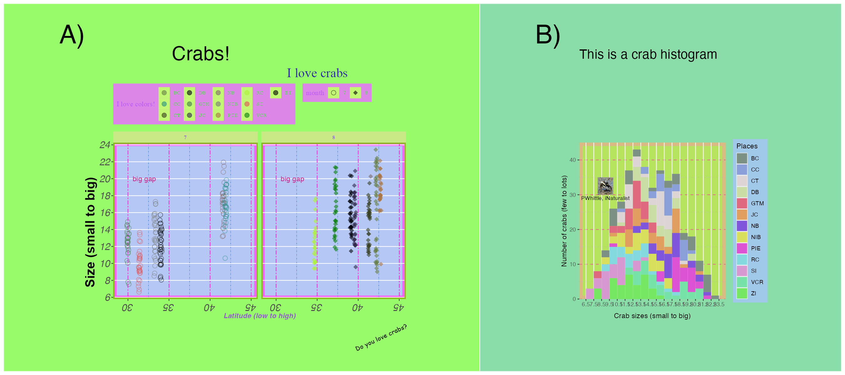
I gave a workshop on figure customization using ggplot and associated packages for UCSB EEMB R Seminar in Winter 2023 using the fiddler crab data from lterdatasampler. I strongly believe in the power of making bad things before you make good things, so we made this supremely ugly plot to go over some fundamental ggplot theme options, inserting images into plots using magick, and arranging them using patchwork.
Links
Blog summary, where you can find more of my musings about figure making